The reader for my magazine will be within the ages of 16-24, interested in indie/rock bands who are current.
80% will listen to a wide range of music within the chosen genre, whilst 20% will both listen to music and be interested in being involved in the music industry, and the background of their favourite bands.70% will be full time students at either secondary or higher education, 30% will have finished or left education. 60% will be male, 40% will be female.
Monday, 17 December 2012
Mission statement
My music magazine will be based on the rock/indie genre. It will be designed in a way that is attractive and will stand out. it will have a specific colour scheme of red, black and white, and, it will be informal in terms of the layout but everything will be clear and have relevance. My target audience will be teens( around 15/16) to young adults( up to 24/25) as that is usually the age for new bands, but that will not exclude anyone over the age group i have set if they are interested in the topics i have included. It will contain information on current popular bands, however will include information on smaller, not as popular bands aswell, to help promote. it will play a main role in the readers lives, as a source of entertainment, and to be informative of their favourite band.
Tuesday, 27 November 2012
NME music front cover analysis
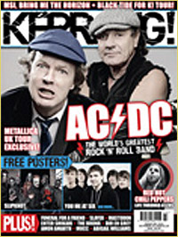
.jpg)
Masthead- the mast head is situated in the top left hand corner, reading "NME" in red outlined in white, and apart from the main coverline has the biggest font on the page. i think because the main coverline has a slightly bigger font, the mast needed to stand out and so they outlined it in white, which is the same colour as the main coverline.
coverline- the main coverline is written in white, which stands out against the dark clothes of the man that it is placed against. the band is called "the killers" and the word "killers" is in a bigger font to the rest of the coverline, as it is the most eye catching word. "the" is written in the smallest font in black, in the corner of the "k" in "killers" and this could be to put more emphasis on the word "killers" which is attracting the reader.
above the word "killers" the magazine has included a quote from an interview with the band that is inside the magazine, and have used the specific quote as it may be enthralling or interesting to the reader, in this case they have used " im having a personality crisis right now" this will make the reader want to read more about this, and big fans who will want to know about the bands lives. the main cover line also reads "can brandon find the plot in time for reading and leeds?" asking a question to make the reader want to read on, and may affect people going to these festivals, so they will want to know the answer.
main image- the main image is of one member of the band, and is set out in 3 different images, as if they have been ripped out and stuck on the front. the pictures reflect the quote chosen in the main coverline, as the photos are all different showing different emotions, just like his "personality".
coverlines- nearly all the additional coverlines appear to be referring to an upcoming festival and in the top right hand corner " PREVIEW SPECIAL" is written in yellow, to stand out against the black background. this suggest that some of the articles inside are one offs, possibly discussing the fesitivals.
Monday, 12 November 2012
Music Magazine cover.
The image.
>going to include one or more people, no image is to contain no more than five models.
The mission statement.
- if there is a person/group on the cover what do they represent?
- are they a stereotype?
- how has this stereotype been constructed?
- the gaze refers to the direction inwhivh the person on the cover is looking.
- are they looking straight at the audience?
- are they smiling? enticing the reader in?
- do they look friendly or cool?
- do they look seductive?
>going to include one or more people, no image is to contain no more than five models.
The mission statement.
- explain what kind of music magazine you hope to createby focusing on genre and style
- explain the audience that you are trying to target
- give a brief overview of the content of your magazine
- explain the role that you think your magazine will play in the lives of its readers.
Wednesday, 7 November 2012
final draft of contents page


Sunday, 4 November 2012
Music Genre.
I have done some research on various magazines, and i have come to the conclusion that i will do a indie/rock magazine. i have chosen this because unlike a pop genre, there are plenty of magazines that you are able to adapt too and cooperate with, such as rolling stones, kerrang, Q etc. the style and layout of these genres are easily recognisable, and the syle and dress code of the artists and made very clear.


Monday, 29 October 2012
Bauer media
Bauer Media is a division of the Bauer Media Group, Europe’s largest privately owned publishing Group. The Group is a worldwide media empire offering over 300 magazines in 15 countries, as well as online, TV and radio stations.
Bauer Media joined the Bauer Media Group in January 2008 following acquisition of Emap plc’s consumer and specialist magazines, radio, TV, online and digital businesses. Collectively, the Group employs some 6,400 people.
Bauer Media is a multi-platform UK-based media Group consisting of many companies collected around two main divisions – Magazines and Radio - widely recognised and rewarded as being industry innovators.
Our business is built on influential media brands with millions of personal relationships with engaged readers and listeners. Our strategy is to connect audiences with excellent content through our broad multi-touch point brand platforms, wherever and whenever and however they want. Our wide portfolio of influential brands gives us advantages over pure play magazine or radio competitors.
Our magazine heritage stretches back to 1953 with the launch of Angling Times and the acquisition in 1956 of Motor Cycle News, both still iconic brands within our portfolio.
The seeds of the company’s radio business were planted in 1990 with the acquisition of London dance station Kiss FM (now called Kiss 100), followed by the acquisition of Liverpool's Radio City and later by TWC and the Metro Group. Then came the acquisition of Melody FM which was transformed into the market-leading Magic 105.4.
In 1994, the company bought a small magazine called For Him Magazine which is now the core of the best-selling international multi-platform brand FHM.
In 1996, we acquired digital music TV channel The Box, as a route into the small screen business, which has grown into Box Television, a seven channel joint venture TV business with Channel 4.
Continuing its history of magazine launches, Closer was launched in 2002 and Britain’s first weekly glossy, GRAZIA, was launched in 2005.
CODES AND CONVENTIONS OF A MUSIC MAGAZINE
A magazine usually consists of different elements which come together to complete the magazine. the elements are..
The mast head. - the title of the magazine, which makes the reader familiar with what they are reading
Main image- usually consisting of the artist(s) that are relevent to the genre of the magazine
Cover lines- around 5 are used which also link/relate to the genre of music.
There is always a main image used which is of the main band or artist, when it is a band it's usually a long shot however when it is a solo artist it is usually a mid shot unless it is a solo artist who is looking at the camera in order to connect to the audience where their body language reflects this audience and the genre of music.
There is always a main image used which is of the main band or artist, when it is a band it's usually a long shot however when it is a solo artist it is usually a mid shot unless it is a solo artist who is looking at the camera in order to connect to the audience where their body language reflects this audience and the genre of music.
tagline- this usually is used to grab the readers attention and relates to the article.
Barcodes,issue number,date,price- All four provide nessesary information on the magazine.
Flashes- usually offering something free or exclusive to the reader
colour scheme- All music magazines stick to a colour scheme, and the colour scheme often reflects the magazine.
All of these are seen in this example of Q magazine :

All of these are seen in this example of Q magazine :

Thursday, 18 October 2012
Analysis of my draft front cover
the mast head. i chose to do this because it is simple but effective as pupils will recognise it straight away. i chose the colours black and yellow because they are the school colours, and so therefore make it more effective.
logo. i chose to put the school logo next to the mast head to show that it is king henry schools magazine, to make it easily identifiable.flash/barcode. i chose to put these on to make the magazine look more authentic, however i think i should of chose a different colour for the flash as purple doesnt go with any of the other colours i used. main coverline i chose this for my main coverline as i thought that it would be a good story to highlight. however, although the colour scheme for this fits in with the theme, i think i should of put it in yellow and black like the title to highlight its importance and to show its a coverline. main image.i chose this because it symbolises the coverline, and having the head master and head of year 8 either side of the pumpkin to show that they organised the event.
other coverlines.i chose these because they were relevant and realistic, however i think i could of made less of them so the page isnt as cluttered.

Tuesday, 16 October 2012
latest cover.
 i have added an extra image of a costa coffee sign, and i have moved the barcode to the bottom of the page and changed the angle, as it was abstructing the males face. i moved the main coverline as it was abstructing the females face, and i move the other coverlines in order to do this.
Monday, 15 October 2012
progress with school magazine
 i have added alot to my magazine since my first lesson on indesign. i added a main image, and changed the font and stroke of my "costa coffee" coverline. i added a flash, with "free diary" written inside, and this was because i had to make the flash smaller in order for it to fit in the place i wanted it to go, and so it wouldnt abstruct the mast head. i added my main coverline with the same colour scheme as my mast head, so the reader will realise its the main coverline and its importance. i have also added a barcode the bottom of my magazine front cover.
Monday, 8 October 2012

Funtions of indesign.
You will need to understand how to use the following functions for indesign:
1. Create a new document – A4
2. Show a document grid
3. Use rectangle frame tool
4. Use type tool
5. Select font
6. Change text size
7. Use colour picker
8. Create text effects using the stroke function
9. Use layers
10. Import an image using adobe bridge
11. Change image size
12. Crop an image.
Magazine notes.
Magazines.
There are over 3000 different magazine titles in the uk, all if which have an audience and a target market.
There is a magazine for almost ever hobby, interest and social group.
List of magazines:
Sport
Computer games
Fashion
Real life
Music
Horse riding
For every broad genre of magazine there are usually many more sub genres.
Music:
Chart music - smash hits
Heavy metal -
RnB -
Rock - kerrang
hip hop -
jazz -
indie – New musical express
opera –
each magazine will have its own identity which may on the surface closely resemble others. These broad similarities are then built on with design and content choices which tailor the magazine to the specific audience.
EXAMPLE.
most rock magazines tend to use similar colour palette. Often they will predominantly use red, black and white. They will also often feature photos of bands performing live. This appeals to their audience and reflects the codes and conventions of the music genre that they cover.
However, there are lots of differences within genres and each genre has its own style and its own codes and conventions.
Design choices.
· Writing style
· Layout
· Features
· Adverts
These all work together to create a style which is specific to that magazine, just like the clothes and hair styles form an image for a sub genre of rock music.
Choosing a genre.
Things you should think about:
· Availability of reference material – is there a range existing products that you can look at and analyse?
· Your own interests – if you have a strong intrest in a particular genre of music you may want to use this as a starting point for your project of you might want to investigate a completely different genre
· Access to the audience-will you beable to carry out research on the target audience of your magazine to help with your production.
· Design style and aesthetics- are you interested in the design and look of a specific genre of magazine or specific magazine.
· Copying- you must beable to take the structure of a magazine and copy it.
“ the best work had a clear sense of genre and audience and a clear grasp of conventions” – OCR examiner report 2010.
In order to gain a good understanding we would recommend that you look at a minimum of 3 existing products in depth.
RESEARCH NEEDED.
Colour scheme, photography, writing style, text/picture ratio, fonts, overall look, publisher.
Excellent analysis will:
Discuss the different elements of the magazine and give details reason for those design choices.
It will look at the magazine as a whole including the front cover, contents page and double page spreads and could also include advertising to build a picture of the audience.
Sunday, 7 October 2012
Questionnaire.
Q1. what year group are you in?
- year 7
- year 8
- year 9
- year 10
- year 11
- year 12/13
- Female
- male
- King Henry VIII school.
- KHS!
- Henry 8!
- King Henry
- breinin harri
- VIII8.
- Other (please state)
- "halloween disco, what will you wear..?"
- NEW DRAMA PRODUCTION! view poll for possible productions inside now!"
- exclusive, mystery interview with a member of staff!"
- the sixth form life!
- other (please state.)
- Clubs and other activities outside of school
- new facilities
- canteen food
- school trips and exchanges
- school musicals
- uniform
- teachers interviews
- pupils interviews
- exam success
- other (please state.)
- talent contests.
- " 2 cool for skool"
- " respecting tradition, embracing the future."
- for the students, by the students.
- by king henry for king henry.
- no.8!
- KHS HAS TALENT!
- other (please state)
- 50p-£1.00
- £1.50-£2.00
- other (please state.)
- yes
- no ( state why )
Sunday, 30 September 2012
Heat magazine analysis.

Runner./ coverlines - along the top of the page, the word "SCANDAL!" is written in capitals on the left hand corner in black and white - different to the rest of the sentence which is in yellow and blue. the fact that its in a different colour may suggest that they want you to be drawn to this paticular story. it goes on to say " "GAV SPENDS NIGHT WITH CHARLOTTES FRIEND!" now we assume that the audience would know who this is, and may be intrigued to find out more on this. at the bottom of the page is a pink patch, and inside in bold yellow writing says "FREE INSIDE!" this is meant to clash with the pink to make it stand out and is an advertisement offering a smaller free magazine inside.
Additional images. - there is an additional image on the top right handside of the page to go with a coverline, and its a picture of "gav" and "charlottes friend". The magazine seem to be using this as evidence backing up their story. this is very stereotypical of a gossip magazine.
Main coverline. - The main cover line reads "doctors chilling prediction for shrinking star.. 'posh's bones could be brittle and her body n pain - this is really serious' " the font gets bigger when the doctors quote is seen, and this may be to enphysis this story and to make the reader want to hear more. They may have chosen this to be the main coverline over other various pieces of gossip as it is a popular illness, serious topic and could affect many people, who after reading it may seek help, so it could also be a slight promotion for the disease. The fact that the main part of the doctors quote is in red indicates to us its importance because the title is also in red, and that the font of the coverline is bigger than the others, and it being centred in the middle of the page also tells us that its the main coverline. Its an interesting story that could also be personal to people, making them want to read it.
Main image. -the main image goes with the main coverline, and is again picture evidence of the story. Its an image of victoria beckham looking skinny, to show that the doctors diagnosis was in fact very true. They may have picked this image as it is true to the statement of the doctor, and to make the reader feel for her and want to read her moving story.
Elle magazine analysis.
 Masthead. - The word "elle" is spaced out across the top of the magazine, and is in pink, telling us this is a more feminine magazine. Also, the back ground is white, so with the heading being in bold pink it makes it stand out. We know that its the mast head because of the font size, as it is bigger than the rest of the writing on the page.
 Main coverline. - the title is also in pink reading "elle exclusive" telling us that it is a main or important part of their magazine, as the title is also in pink. it then enlarges the font to say "EMMA WATSON" indicating that this exclusive story will be on her. underneath it reads " £10 million in the bank at 19, so whats next?" this may be to draw the reader into finding out the background story and what does happen next. It is at the lefthand side of the magazine, possibly because people naturally read from left to right, so they will catch the most important coverline first. We know this is the main coverline because it matches the main image which is of her.
main image. - The main image is a picture of emma watson, and is our only image on the cover. The target audience for this magazine should recognise her as an actor/model, and this could be significant to the type of magazine that this is. she is sat on a stool posing, and wearing a chanel top, possibly promoting the clothes. We know that the main story is about her, and that is why she is the main image on this magazine.
Coverlines. - in the middle of the final two letters of the masthead is an advertisement. the word "FREE" is above in in bold pink. From the other coverlines, we see that the colour pink is used to emphasise somethings importance in the magazine, so we are instantly drawn to these colours. underneath it then reads "STYLISH MANI OR PEDI FOR EVERY READER." the significant parts of this sentence are bigger than the rest, as you notice them first. On the right hand side, this is a font that is slightly bigger reading " THE NEW TRENDS." the word 'new' is in a graffiti style and is pink, which as we now know shows us that its important. some other coverlines are highlighted in pink, suggesting that they are of more importance than the others, and may be more interesting and are in pink to intrigue the reader. From what is written on the coverlines, we can gather that this magazine is a gossip and fashion magazine, as it offers information on emma watson the actor/model, and also offers stories and advice on fashion and beauty eg; the free beauty treatments for every reader.
Price. - underneath the final letter of the heading, the issue month has been published and the price is underneath it at £3.60 and is in a smaller font to anything else written on the magazine.
i like that this magazine uses the colours pink black and white to project a girly and femine theme, and shows that this magazine may be specifically aimed at a female audience rather than male.
Q magazine analysis.

Main cover-line - The main cover line reads "Sexy beast, lily allen, & her wicked, wicked ways..." this suggests that there is a seductive story in this magazine, and may aim at a specific audience. The word "wicked" is in red and repeated twice, possibly to enphysise the importance of this word. The fact its in red (as is the background of the masthead) may suggest that its important or significant.
main image. - This image fits perfectly with the main cover line. It backs up the evidence to suggest a seductive possibly romantic story line due to the main image being of lily allen facing with her back to the camera looking over her shoulder, and she is topless. Surrounding her are two black tigers, again projecting the seductiveness presented. This may make the reader intrigued as to what is written about her inside.
Coverlines. - There are various other coverlines on the top right hand corner of the magazine. They all show what type of music magazine this is, with bands like U2, Oasis etc discussed, it shows the magazine does in fact have a specific target audience. The fact that the word "exclusive" is in red tells us that its important, as all other important aspects of the magazine have been highlighted in the colour red. Other coverlines are situated at the bottom of the page running along the bottom offering advice on how to purchase things, and other small interviews with people of a simular genre.
Flashes. - there is one flash on this magazine on the right handside, reading " the 25 greatest rock movies" this finalises what type of music genre this magazine specialises in, and is offering a list of rock movies that might interest the audience.
i like the layout of this magazine because it is specific as to what is inside, and does not appear to be misleading. I like that its spaced out, so everything is clear and easy to read. I like that that chose an intriguing storyline for this paticular issue, to make the reader want to buy it.
Subscribe to:
Comments (Atom)